This post and the photos within it may contain affiliate links. If you purchase something through the link, I may receive a commission at no extra charge to you.
Hello, calligraphy lovers!
My name is Stella, and I am a calligraphy artist & designer based in Hong Kong.
In this article, I am super happy to share with you the process of making a unique calligraphy wedding invitation, which I did earlier for a client.
This is not a tutorial per se, as there are certainly many different ways of making a calligraphy wedding invitation. I just want to share the experience of my working process here.
I hope you will like it.
Let’s have a quick look at what we will be going through in this article –
- Overview of the project
- The tools that I used for this calligraphy wedding invitation
- Planning the composition & layout
- First & second draft
- Final draft – Putting it all together
- Presenting the finished piece
- Process video
Without any further delays, let’s get started!
1. Overview of the project
Whenever you work on a more complex project, it is crucial to start it by having a clear overview of all the elements.
First of all, here is the content that I needed to write.

Invitation content
Below are listed the requirements and expectations from the client,
- Fully hand-written invitation
- Video – a video of the writing process of the full invitation.
- Photos – photos of the finished invitation with a beautiful setting.
- Original artwork – framed by the client.
- The style must be –
– very special and memorable as it’s a once-in-a-lifetime event.
– be impressive, especially to his Bride!
– not be too formal or dull, better be a bit vintage, and having a light touch of Royal luxury feeling.
Next up, it’s a list of the tools that I used to create this piece.
2. The tools that I used for this calligraphy wedding invitation
I will list the tools that I used, and later in the article, you will see where and how I actually used them.
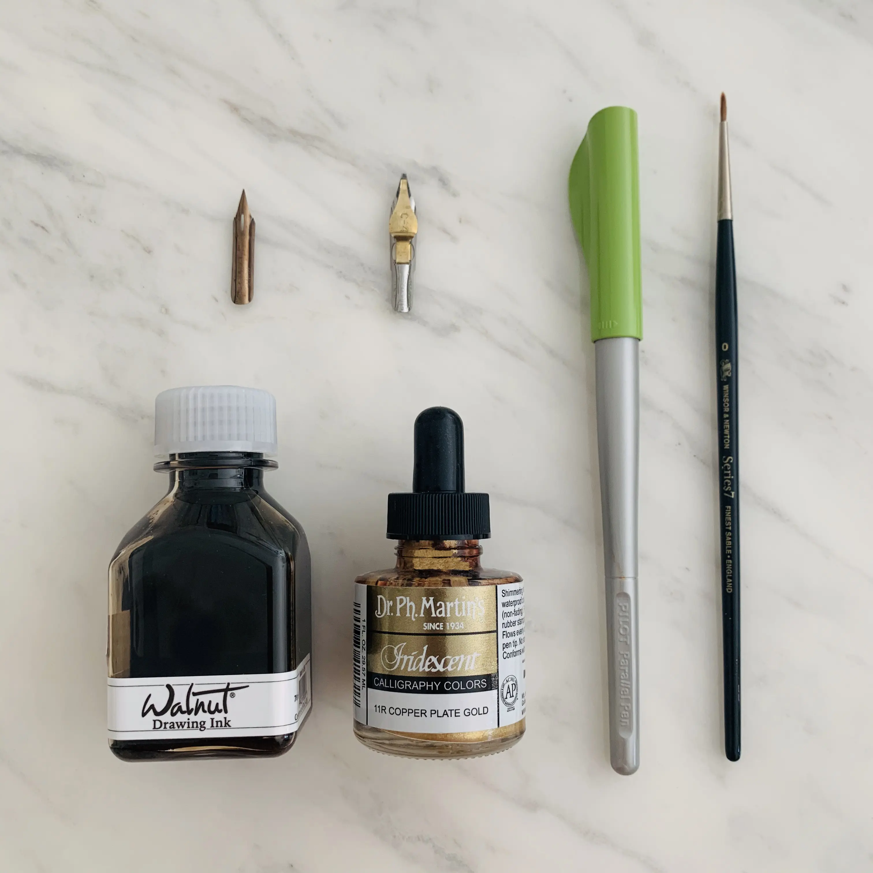
Here are the tools used for this project (links to Amazon) –
- Khadi (handmade) paper – A5 (5.8 x 8.3 in) 150gsm
- Pencil
- Eraser
- Ruler
- Pilot Parallel Pen 3,8mm (with red ink)
- Nibs – Hunt 22 & Speedball C4
- Inks – Walnut ink & Dr.Ph.Martins 11R Copperplate Gold
- A brush
Ok, now let’s go through my design process.
3. Planning the Composition and Layout
In this phase, we are going to go through a couple of different elements –
- Section and hierarchy
- Determining the styles
- Creating an initial template
- Overview of the layout
Let’s get started.
Sections and Hierarchy
The first thing in designing the layout is determining the sections and hierarchy of the content.
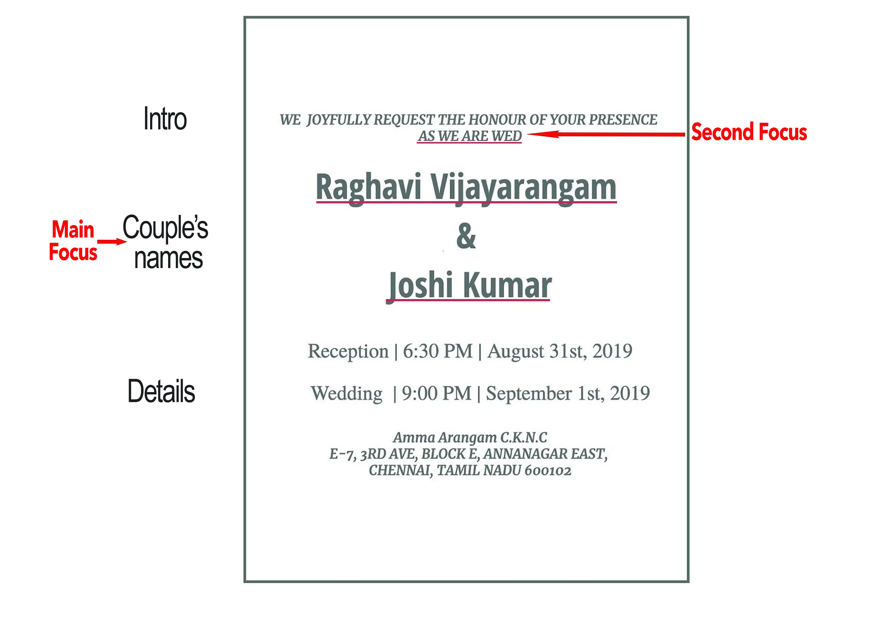
Let’s retake a look at the content. It was divided into three main parts – Intro, Couple’s Names, and the Details.
The main focus was undoubtedly the names of the couple, the next focus was the phrase “As We are Wed” in the introduction, which was the main point there.
So these two needed to be emphasized particularly.
Determining the styles
To emphasize the couple’s names, I decided to use two different script styles.
A bold Gothic script for the Couple’s Names, and the elegant Copperplate style for the other information details.
Mixing different script styles will create a nice contrast, and it also helps to group the content and putting a focus on the crucial elements.
However, using too many styles could cause the opposite effect.
So it must be well considered in terms of the purpose and content of the artwork.
4. Creating the first & second draft
Instead of immediately putting everything on the final piece of paper, it’s a good idea to create at least one or two rough drafts.
This will allow you to see how the invitation will look like and if further improvements are needed.
First template and draft
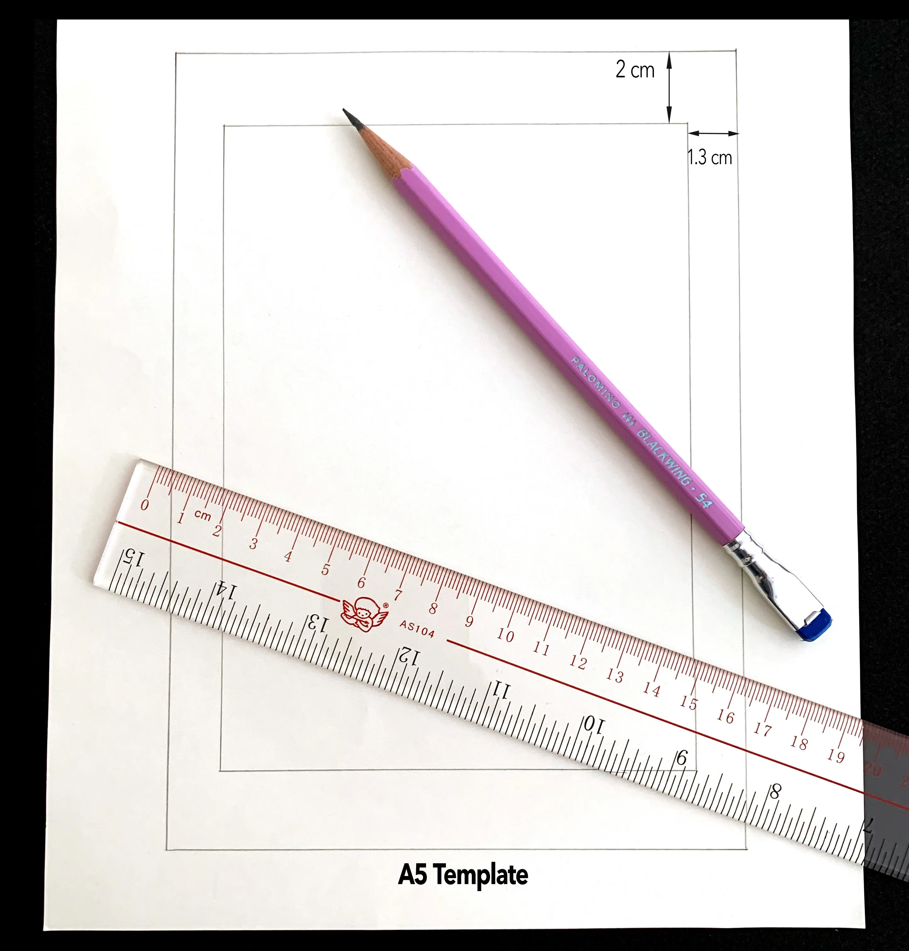
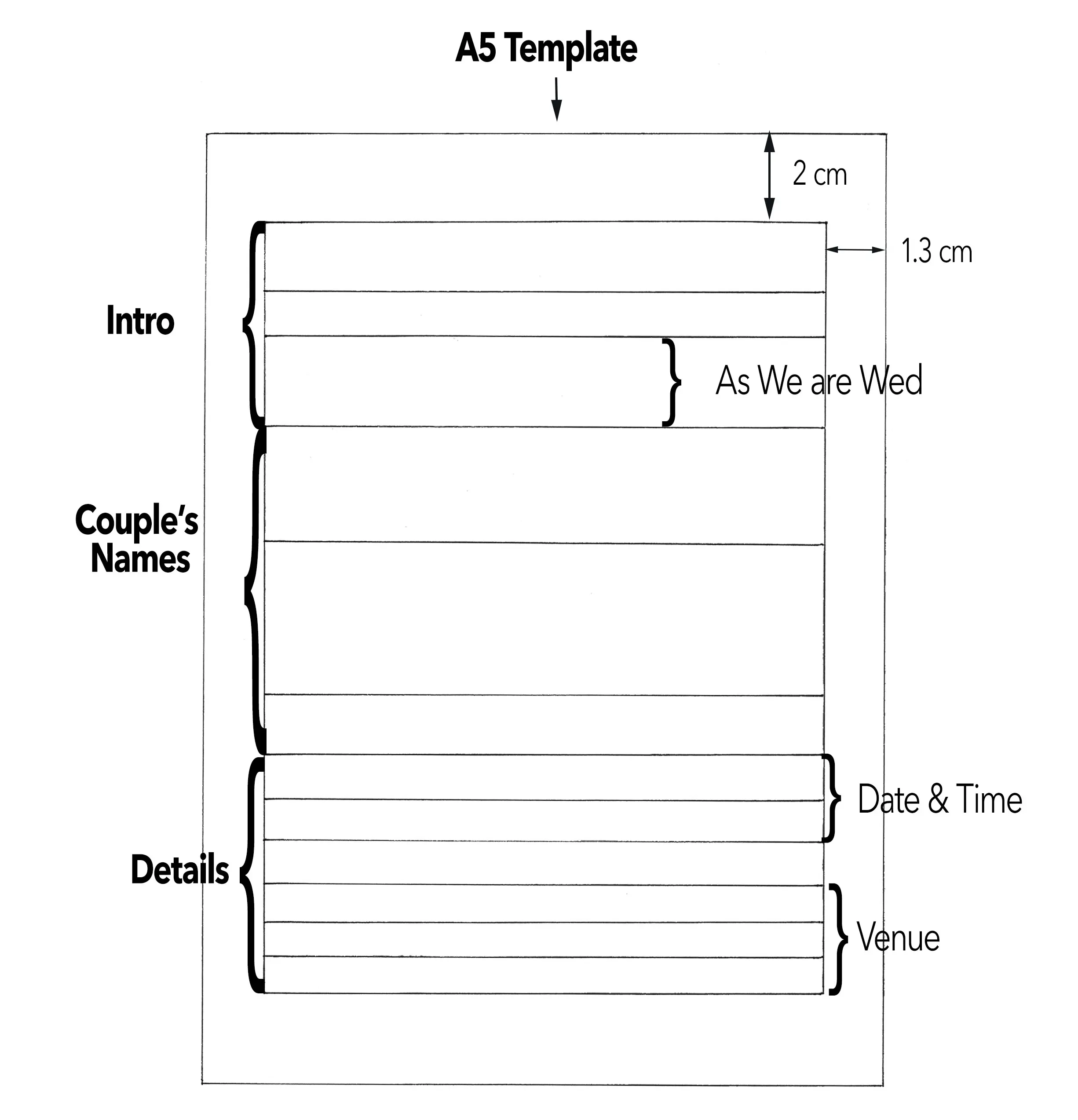
Let’s start by determining the margins first.
I was not going to put any frame or decoration around the text.
So I wanted the content occupying more space and set the margins at 1.3 cm on the left and right, 2cm on top and bottom.
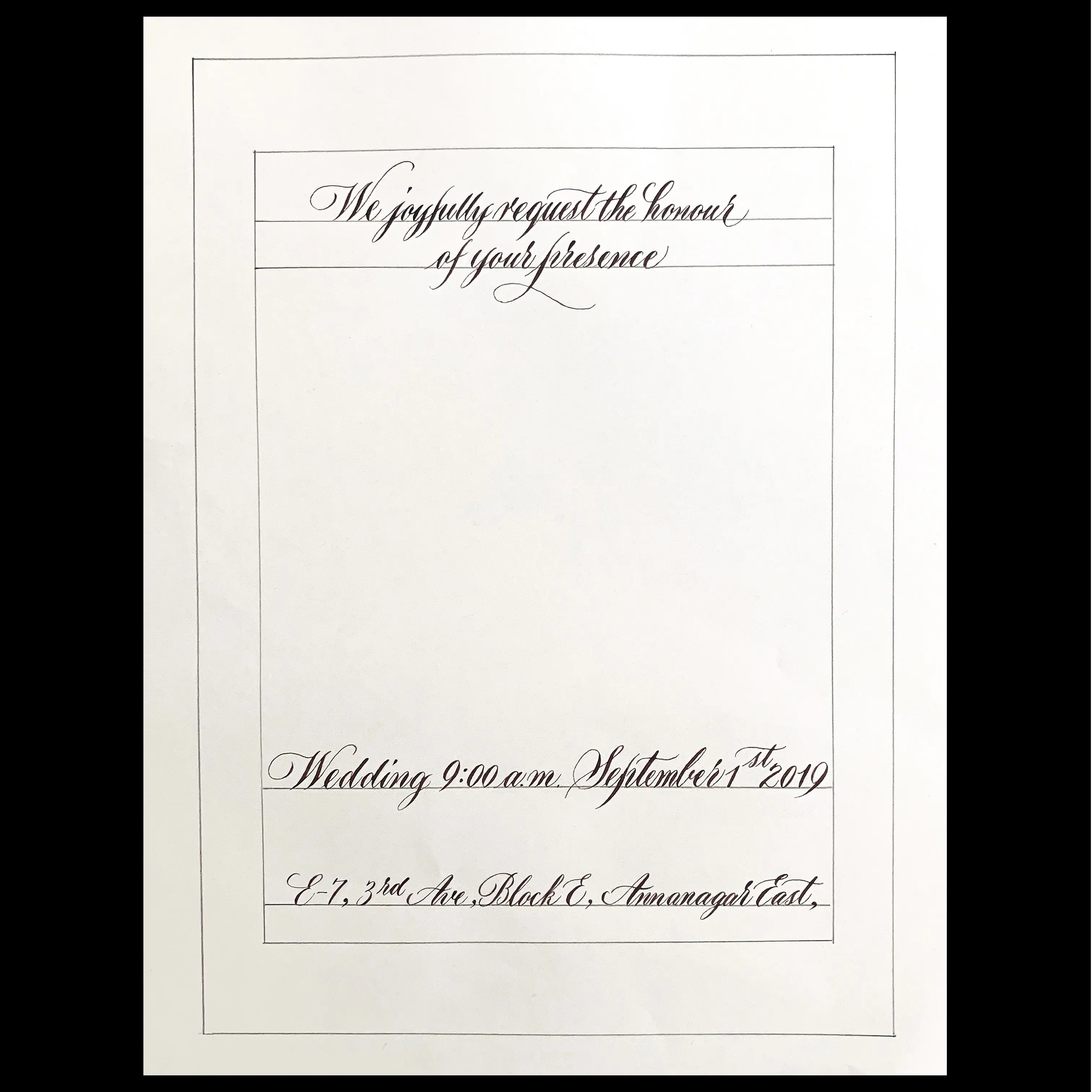
Before proceeding with the layout planning, we needed to have the estimated script sizes.
I always do that by picking up the longest sentence and write it once.
In this case, it was the first line of the invitation.
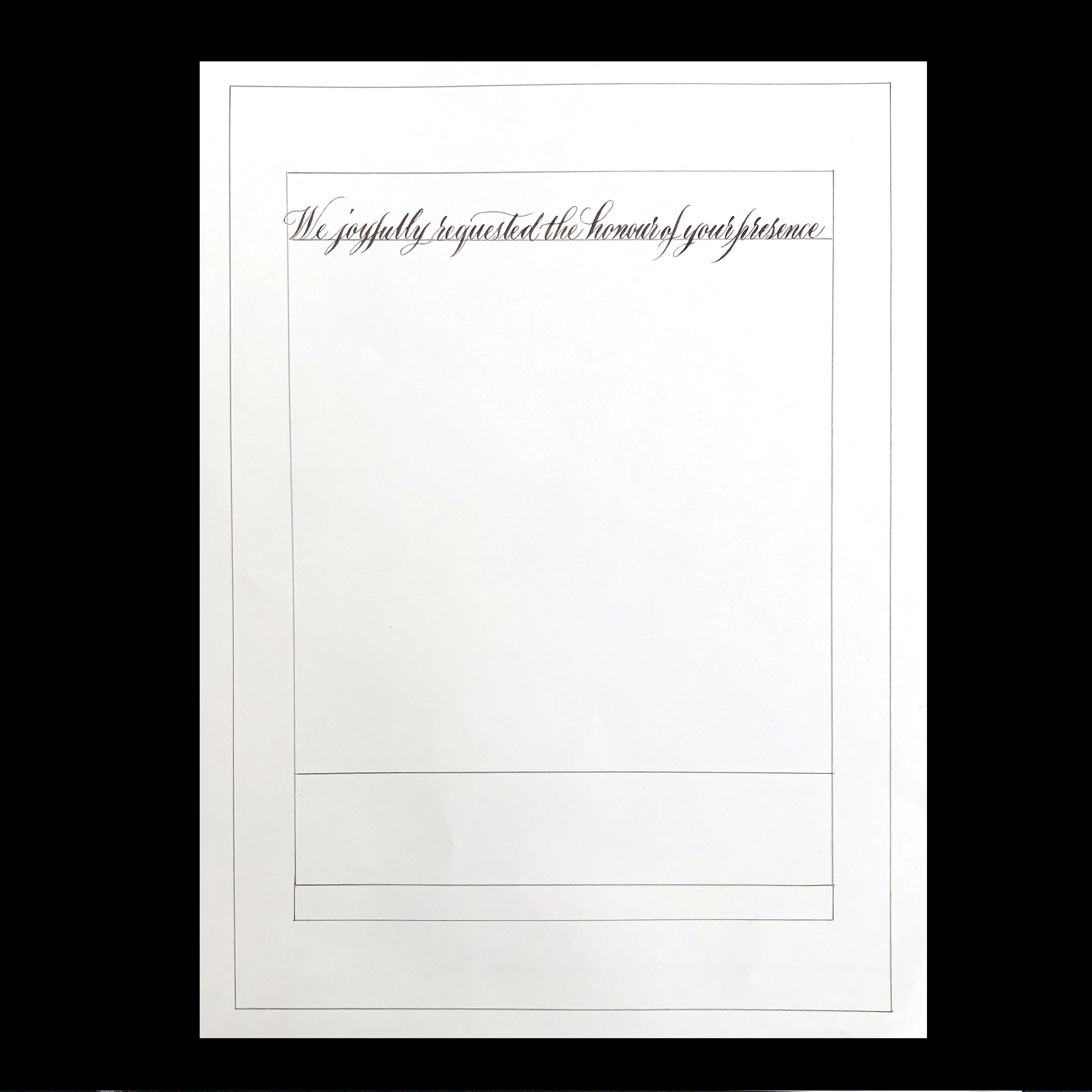
You may have noticed in the image above that the first phrase was too long that the scripts looked too small and tight.
Therefore I decided to separate it into two rows.
I also tried writing the other two most extended lines at the details section and figured out the estimated script sizes.
Now that I have enough information, I can create the first template for the first drafts.
The first template can then be made as below,
- Couple’s Names
– occupying the most prominent space.
- Intro and Details
– more space for the phrase “As We are Wed.”
– the size of the first two rows at the Intro would be the same as that of the date and time at the details, while the address would be slightly smaller than the rest.
I will use the template I just created to write down the whole invitation.
No need to worry about the center alignment at this point, as we needed to measure the width of each written line from this first draft, and use it to make the second template.
Creating a second template (improving the first one)
On the second template I can now focus on aligning the text on the center of the page.
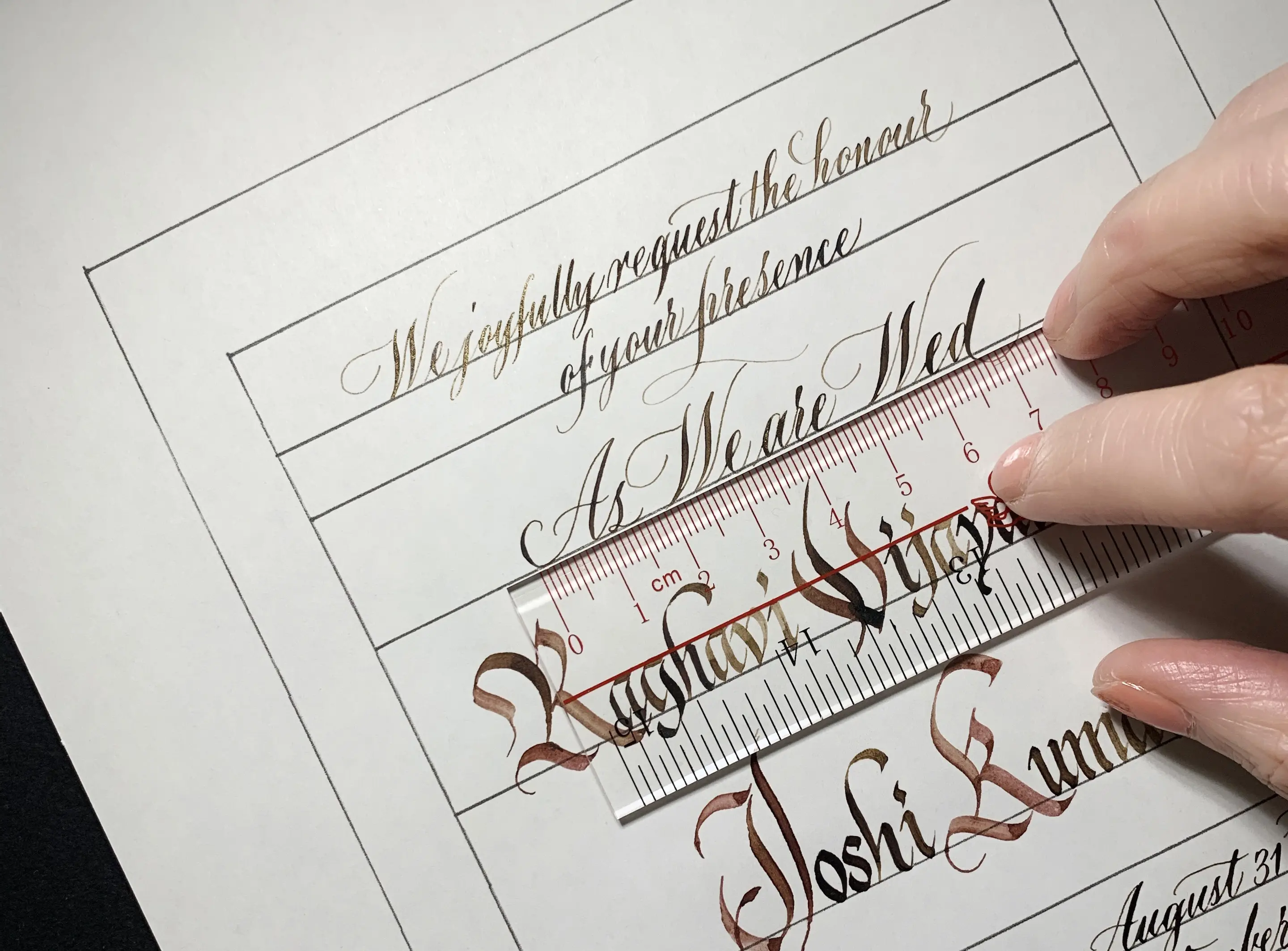
You can see in the image below how I’ve marked the beginning and ending for each line.
Also, you may have noticed that the couple’s names were not eye-catching or big enough, as the length of the Bride’s name limited the size of both names.
So I decided to enlarge only the 4 initials of the names with a bigger nib size.
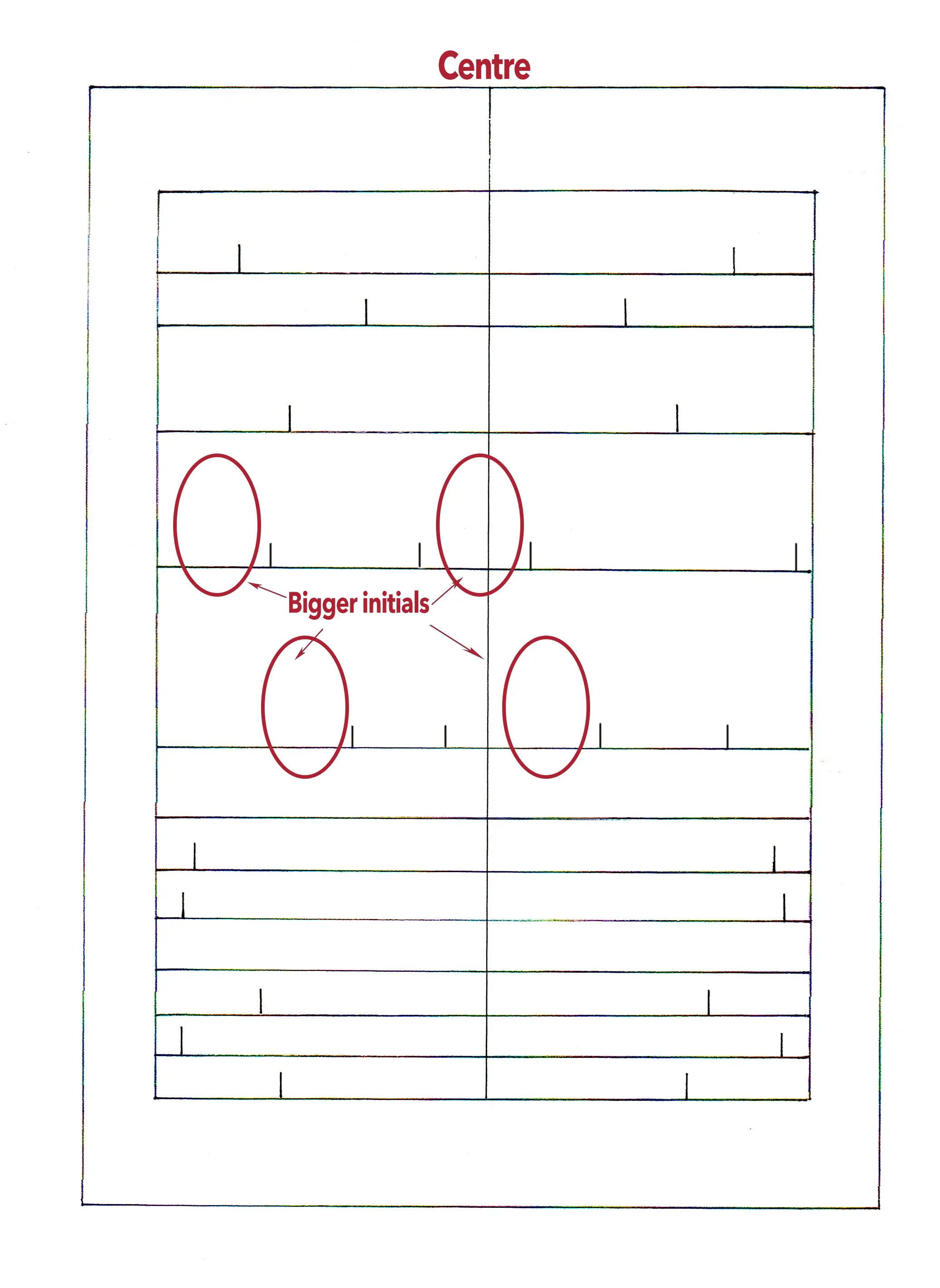
Writing on the second template resulted in a much better layout.
Now I can focus on the composition, spacing, balance, and other details.
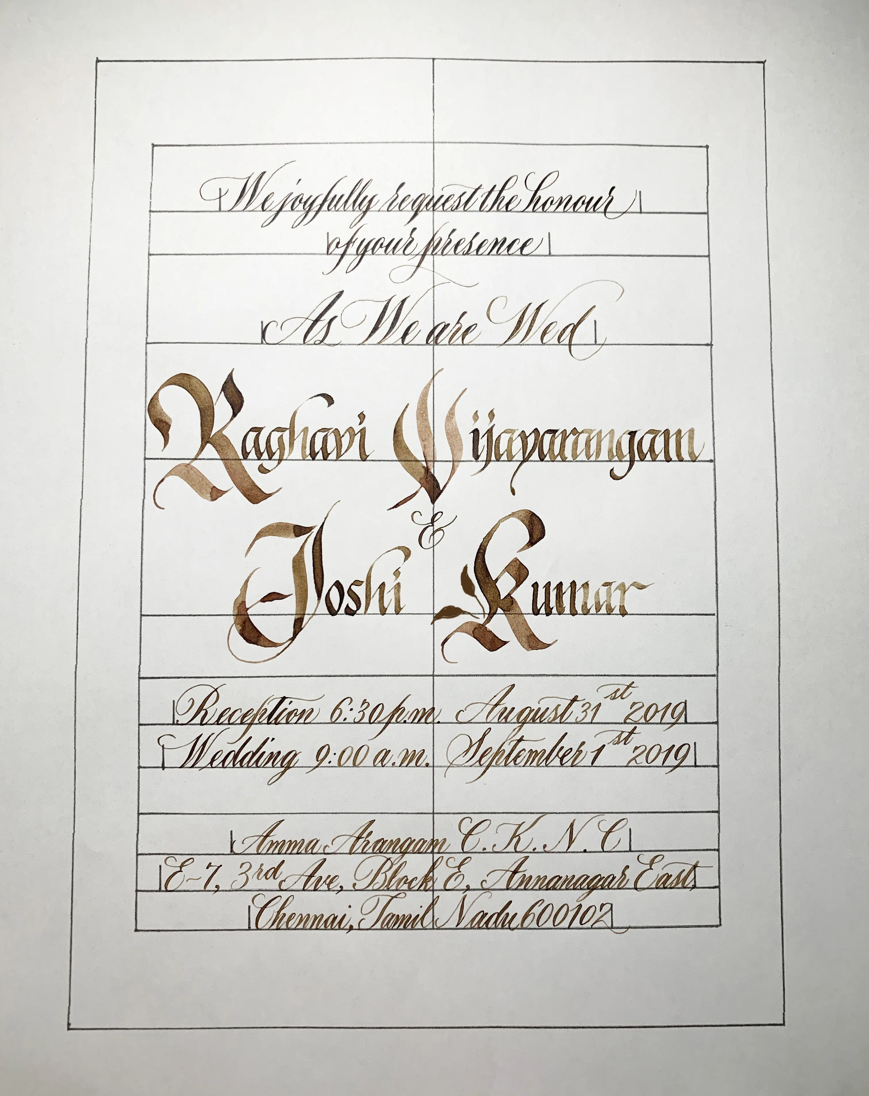
Third (and final) template
The second draft above could actually be a mockup, it usually would be more comfortable by directly tracing over it to get a precise output.
However, the client also requested me to create a video of me writing the invitation.
So tracing over in the video was not a good idea in this case.
I was considering the option of putting the guide sheet underneath the paper and use a light-box.
However that also didn’t look goo either.

Finally I decided I could make a few simple guides on the actual paper (make it simple as too many guidelines can be a distraction in the video).
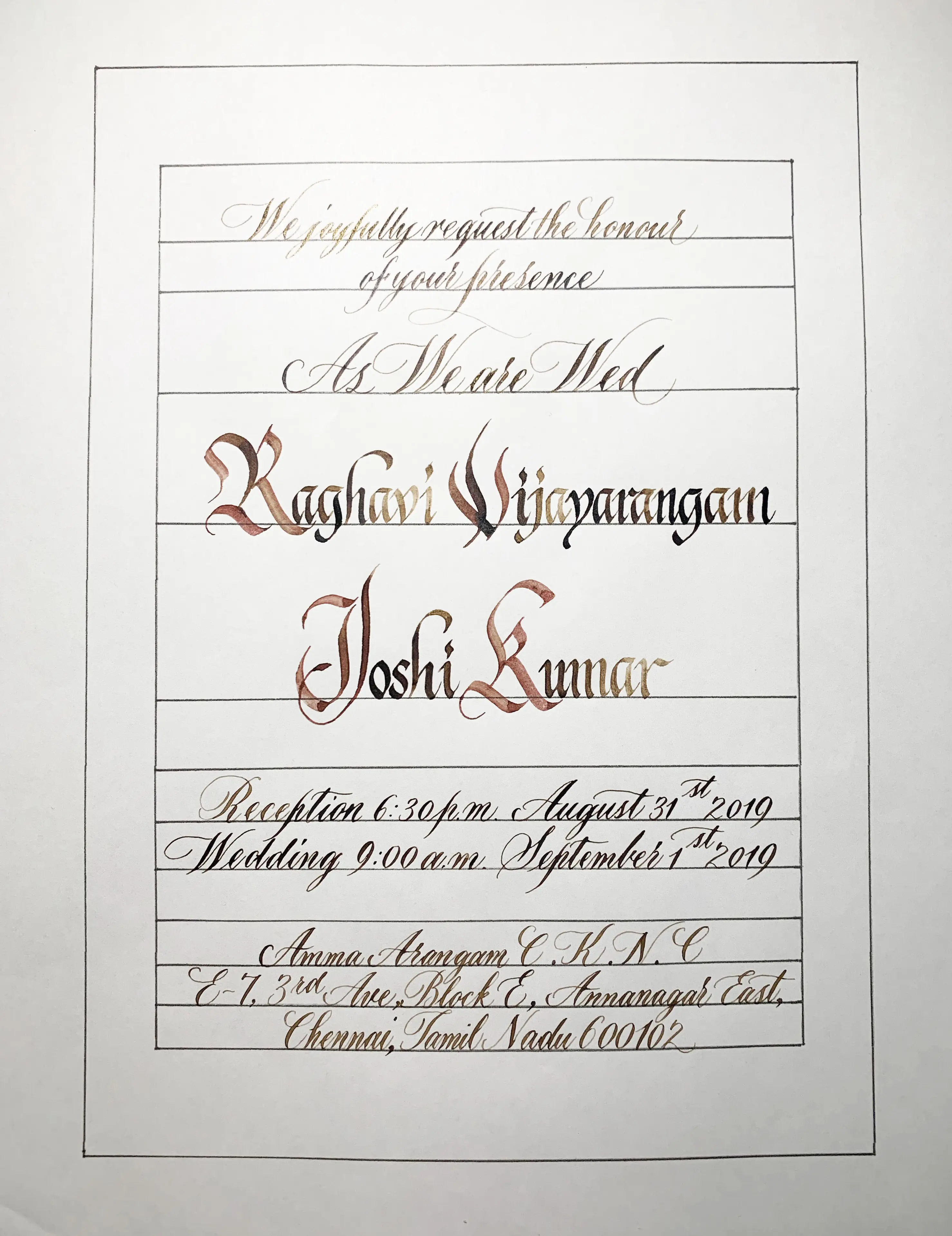
So here is the third and final template on the real paper for the invitation.
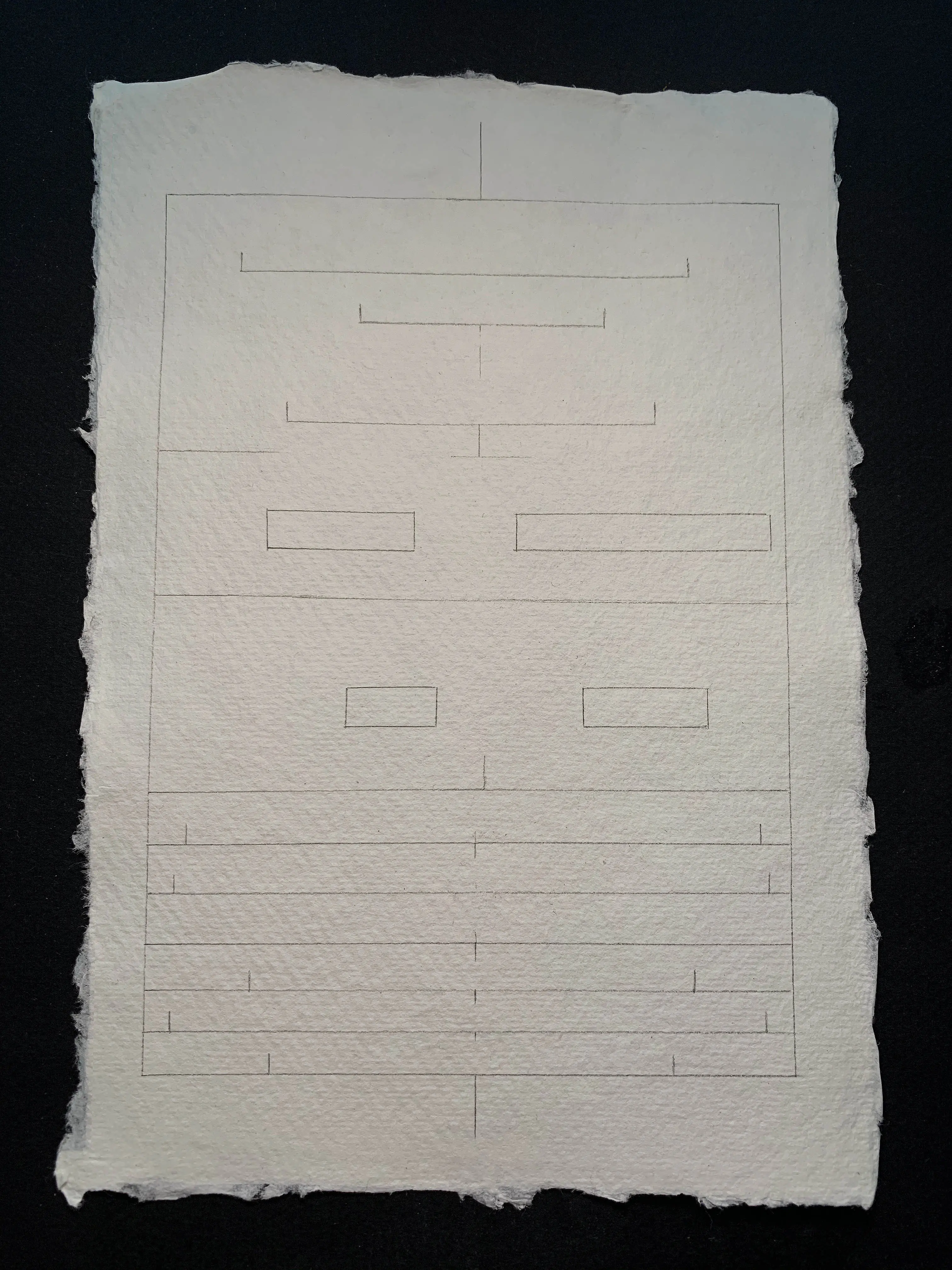
Perfect!
Now that I have the final template in place, it’s time to put everything together.
I can now introduce the tools I mentioned in the beginning of this article.
5. Final draft – Putting it all together
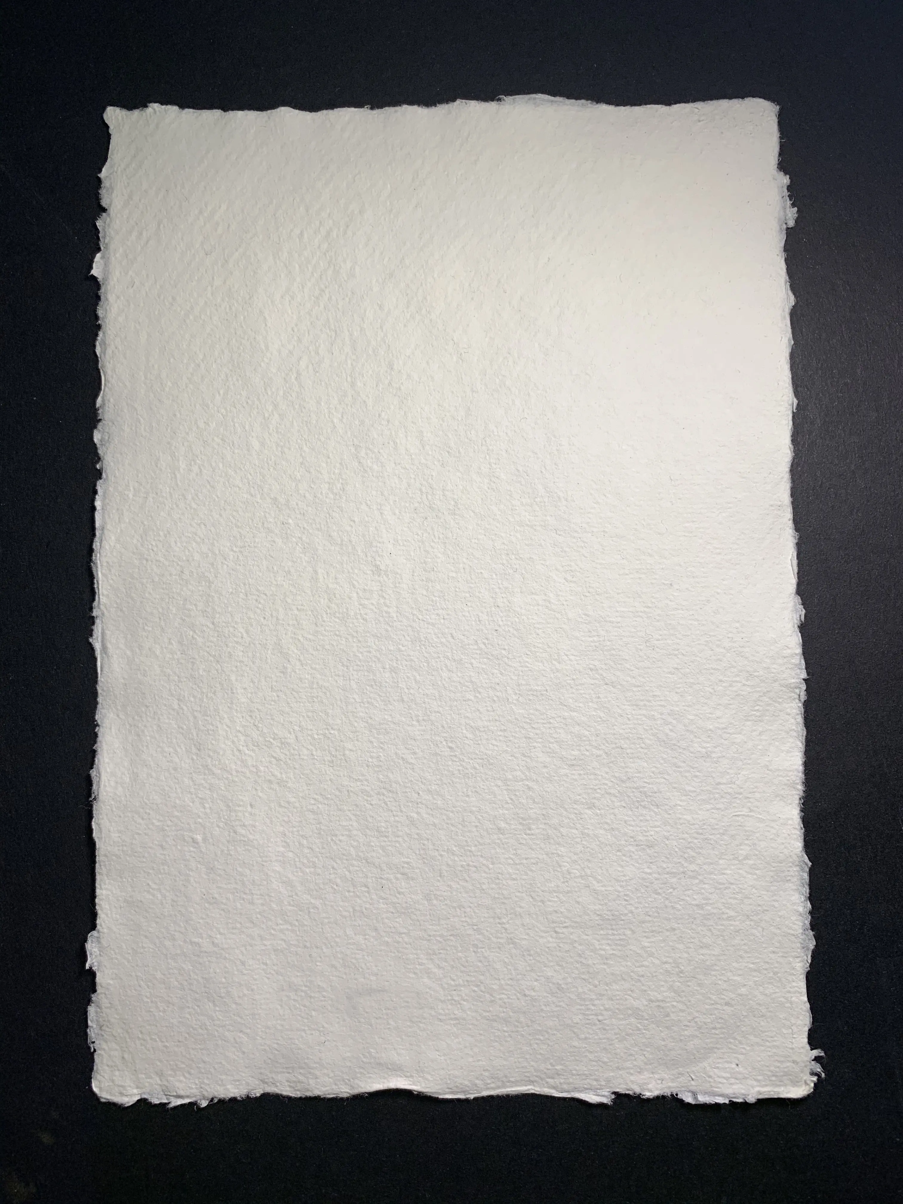
For this invitation, I will use a special kind of paper (as you’ve seen in the image above).
To enhance the vintage feeling, handmade paper is always the right choice.
I chose the handmade paper from Khadi, A5 size, and 150gsm (210gsm would also be nice) with a medium rough surface in white.
Their papers look so lovely, no matter in real or under the camera.
Next up, it’s time to introduce the colors.
As with the choice of different calligraphy styles, you have to be careful with your color choice.
The only 3 colors I used here were red, brown, and gold.
I used them both individually, mixed, or layered to increase the richness and variation of shades.
The content (Intro and Details)
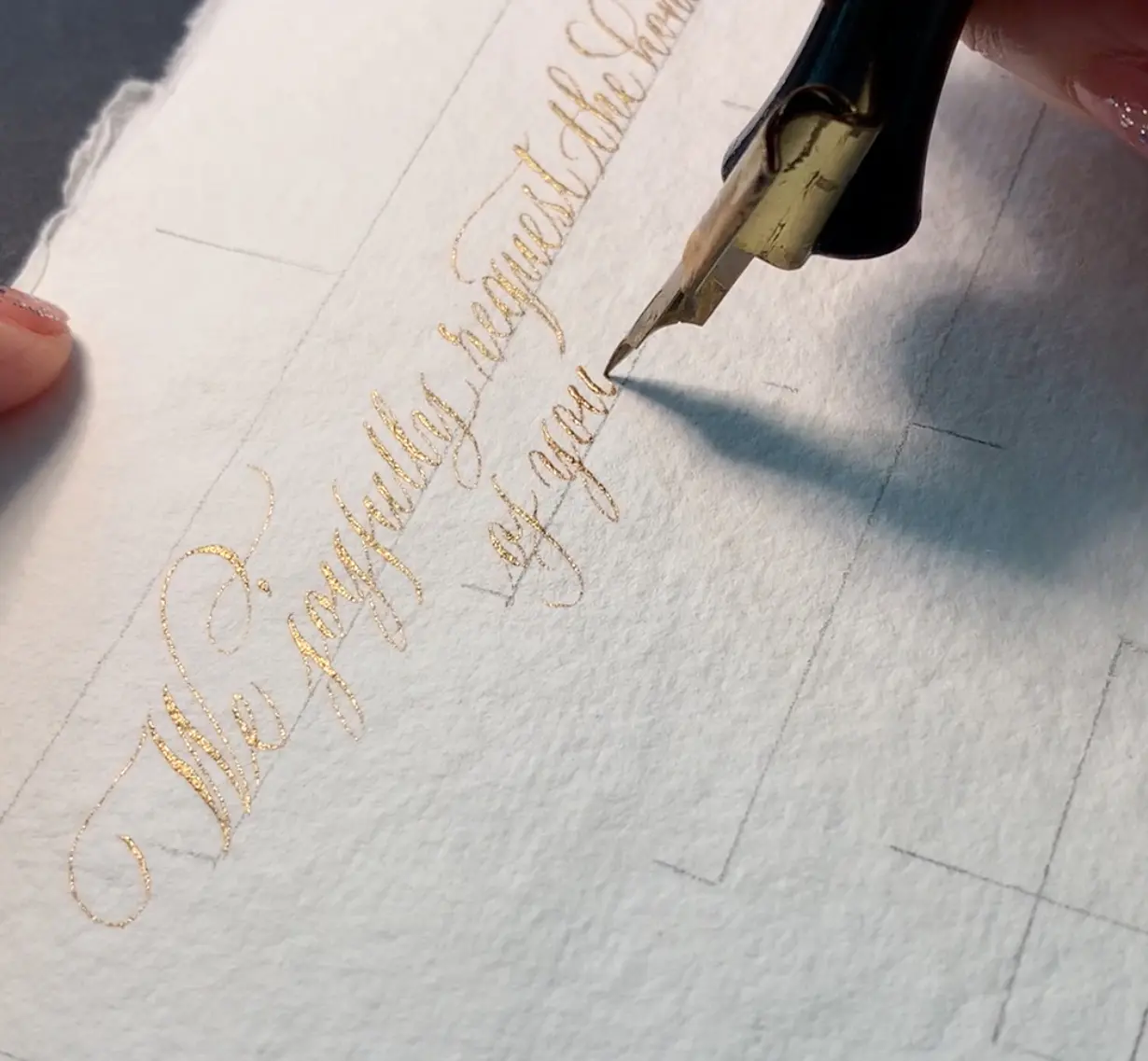
– To achieve a light touch of royalty, gold was my choice for the copperplate script there, I chose Dr.Ph. Martins 11R Copperplate Gold as I like its shimmering look.
This ink is waterproof, non-fading, and doesn’t bleed easily on most textures or materials, so it definitely works well on handmade paper with dense textures.
– The pointed nib for writing the content was Hunt 22, which is my favorite nib.
It writes fine strokes but doesn’t scratch much on heavy textured paper.
Couples’ Names
I love the dark brown vintage color of Walnut ink, it matches well with handmade paper, so I decided to use it on writing the names.
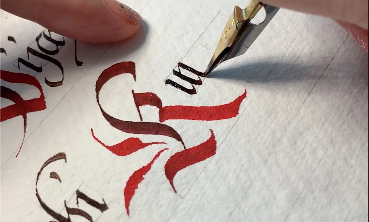
Meanwhile, I wanted the Initials to be even more eye-catching, so I used red on those 4 Capital letters.
Pilot Parallel Pen 3.8mm was just perfect for writing the 4 initials with its original red ink.
For the rest of the names, I used the speedball C-4 nib.

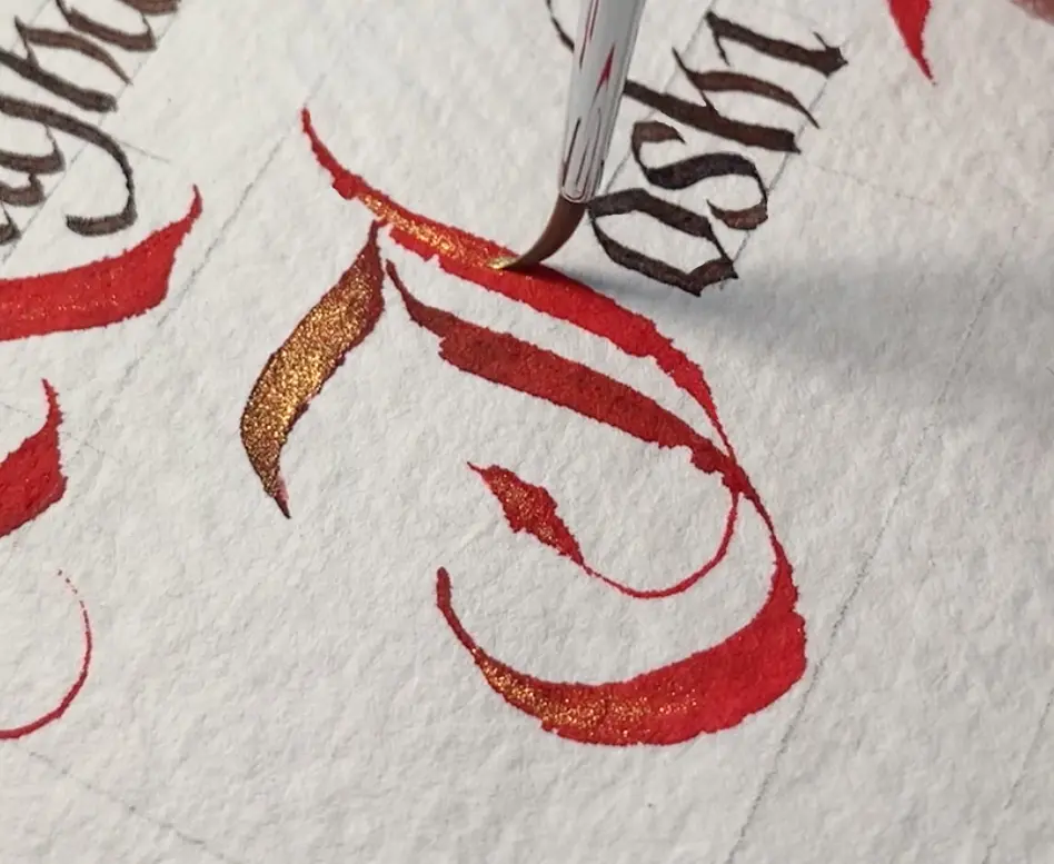
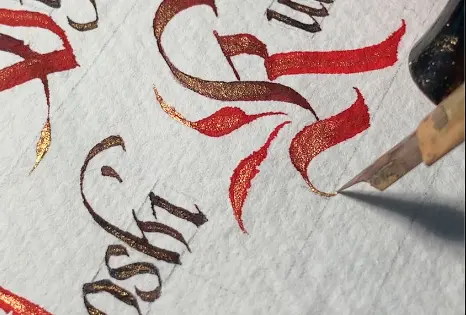
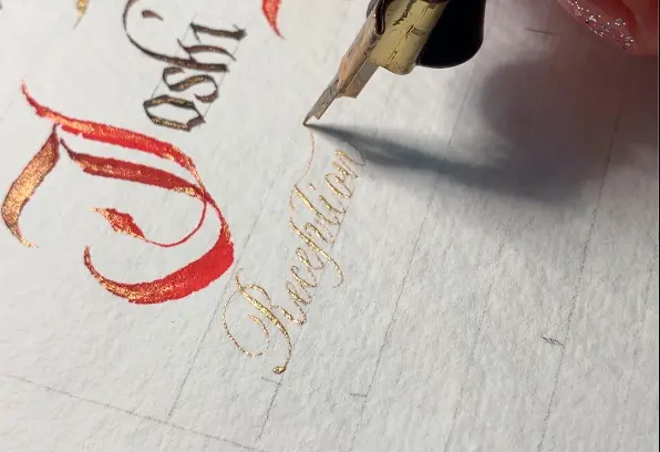
To contribute to the ”royal mood”, I’ve added a light touch of gold on top of the letters by a small brush and a pointed pen in some finest areas.


- Final Mockup
When everything is decided and set, I wrote a final mockup to ensure everything was fine before the video shooting.
6. Presenting the finished piece
As per the client request, it’s time to create a nice presentation of the finished project.
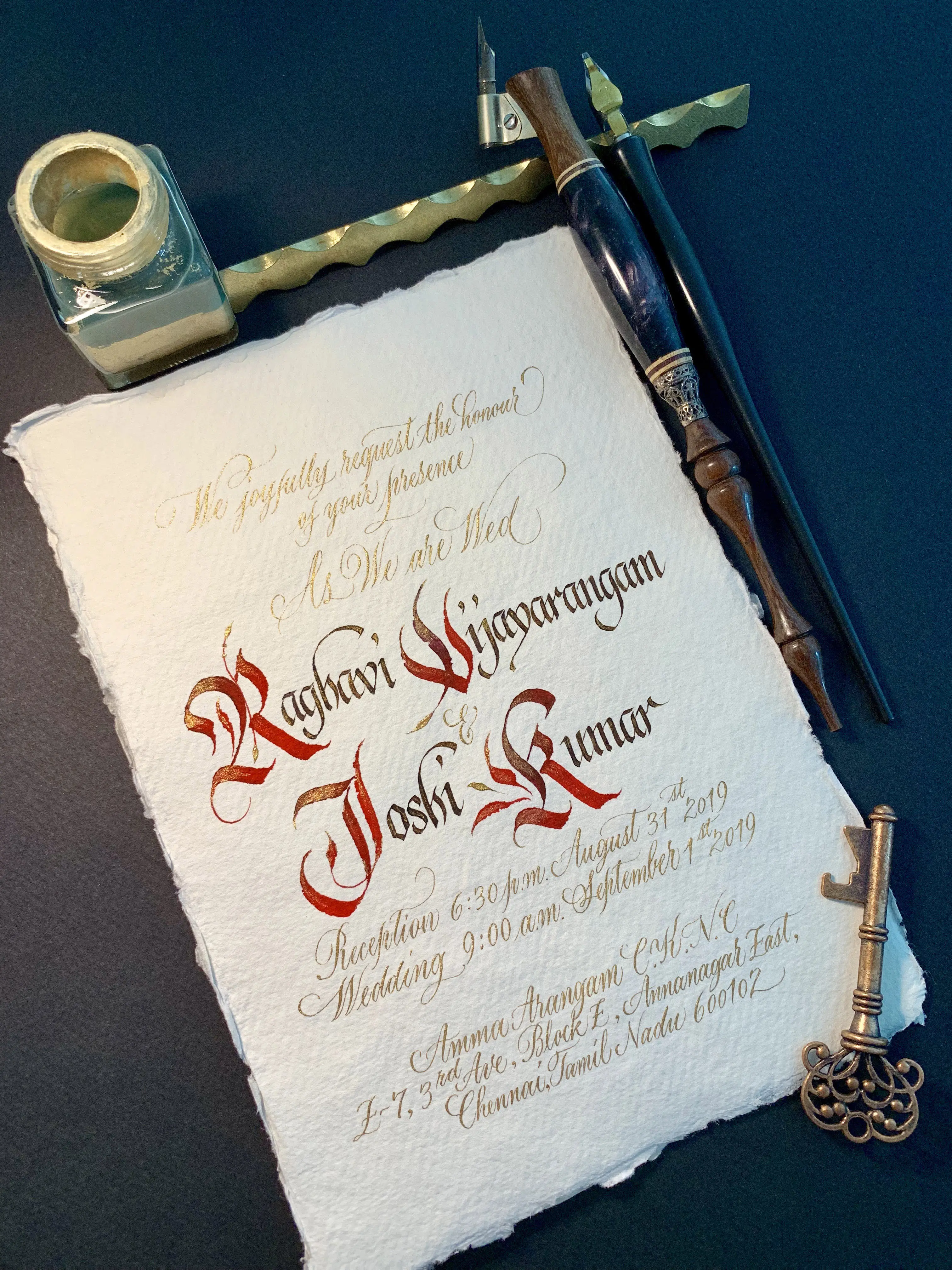
1. Photo shooting
Simple setting with ink bottle, pens, and pen stand, the oblique pointed pen holder made by @milescalligraphy fit the mood perfectly.
I also put a key there which matched the theme.
Remember that less is more, the focus is always on the artwork itself, too many props in a photo may have the opposite effect.
I used a black background to help the invitation stand out more.
Same as the video shooting, I used both natural light as well as a desk lamp for catching the shimmers of gold.
Again I used my iPhone to take the picture, but a professional camera is always the right choice.
2. Video shooting
A professional camera would definitely be the best and highly recommended.
Still, in my case, I used an iPhone for the video shooting, of course, I told my client at the beginning.
He was absolutely satisfied with it (communication with the client is essential, always let them know your condition and decision).
Have some good lighting.
I use both natural light and a desk lamp when shooting something with gold or shimmers, I usually put a desk lamp nearby to reflect the shimmers.
Make sure the working desk is both handy and tidy before the shooting. Then everything is ready to go!
Video Editing
So that’s the process of making the whole invitation, I gave a full writing video to the client as per his request.
However, I did edit my own version and put on my social media platforms.
And I am happy to share it with you here.
I enjoy making the video, and I usually use Adobe Premiere to do the editing.
To enhance the mood, I love matching nice music to the video (never underestimate the power of music).
There are many sources of getting royalty-free music. Always check the terms and conditions of the music and the site offered before downloading or using it.
Wrapping it up
That’s it, guys!
Thanks for joining me and I hope you liked this article.
Essentially, you could use the same process of planning not just for wedding invitations, but for any sort of calligraphy piece that involves multiple words.
Avoid just rushing into the project, take the time to plan your steps, and I promise you will see much better results at the end.
If you have any questions, be sure to reach out to me or drop a comment below.
You can see more of my work by visiting my website and social media platforms.
Finally, thank you, Lettering Daily! 🙂
If you’re a complete beginner, make sure to check out the ultimate guide for calligraphy beginners.
Pin me!
Stay updated with my tutorials and get instant access to the Lettering Crate –
A growing library of free lettering & calligraphy resources that includes –
About the author

Stella is a Hong Kong-based Designer and Calligrapher who loves
creating, and exploring the beauty of everything.
Stella started learning Chinese Calligraphy and painting at the age of
16, she also explored a bit in Japanese and Western Calligraphy when
she was studying in Japan. As a fashion graduate, Stella also studied
Multimedia design. Her career life had always been related to the
Fashion world, it wasn’t until 2014 that she had her interest in
calligraphy rekindled. Stella decided to leave her daily job in fashion
brand management and chose to focus on her own passion – creating
with Calligraphy, Design and Multimedia. Since then she has started
designing and writing for different clients and brands, she also teaches
occasionally.
Stella loves learning the classic scripts, she also loves developing her
own style and bringing both of them into her work. It’s her interest in
experimenting and putting elements with opposite characters on the
same piece of work. She wants to keep on exploring and enjoying the
endless possibilities in creating beautiful things!


I found Stellashism again! I didn’t see your article until today, but I see you have continued your beautiful work, and you have a website as well! Max has such good taste finding people to show us what beautiful work is possible! Thank you for the article, best wishes!
You are awesome Linda! Thank you so much for always being so supportive. It means so much to me.
Hey Stella!
This was really helpful. You literally walked us through the whole process! And I must say, the wedding invitation was really really pretty!!
Also, when you get an order for a custom wedding card design, you make all the wedding cards by hand or make 1 card perfectly and get the rest printed on the same paper..?
Glad to hear that you liked the tutorial!
That’s a really good question and I think it depends on the occasion. To give you a more precise answer, I will ask Stella to comment on this 😀
Hi Khyati,
Sorry for the late reply!
And thank you so much, glad to know that you like the tutorial!
Regarding to your question, it really depends on the clients’ requirement. sometimes we just need to make one and get it printed, and sometimes we need to write guest name on each invitation.
The above case mentioned in the tutorial is different, that’s an invitation in video format. My client sent my invitation writing video to his guests online. And he framed my original piece and hang it at their home. 🙂
Thank you for this beautiful example and clear descriptions of your flow of work. I am inspired to slow down my production if I could get the kind of results you get.
I like to work with waterproof inks on most of my work. I have had some disappointing accidents when even a little bit of water drips on an item of mine and resulted in some damage that cannot be touched up. These have required redoing the work. Since I am working on a psalter with what will be some 135 or so items, I have taken to finishing a piece with acrylic spray, clear matte finish, on these items. I am wondering if you have used or would use a final overcoat to protect your results. What is your recommendation and experience?
Hello Gary, thank you so much!
I do sometimes use acrylic spray to protect the work, but honestly I personally don’t like using it unless that’s really necessary. That’s why I like using waterproof inks as well. In my above case, my client was going to frame the work, so I finally chose not spraying coating on the top. 🙂
Thank you Stella – that was so interesting and informative.
Many thanks
Dianne
Sydney Australia
Thank you Dianne, glad knowing that you like it! 🙂