This post and the photos within it may contain affiliate links. If you purchase something through the link, I may receive a commission at no extra charge to you.
Italic calligraphy is one of the most famous calligraphy scripts in the history of the Latin Alphabet.
It is a very dynamic and versatile script with many variations, and in today’s tutorial, we are going to cover the very basics to get you started.
This tutorial was created in collaboration with the very talented South Korean calligrapher known as @Slo.Leecalli.
Slo is a professional calligrapher focused on traditional scripts, and he was kind enough to share tool recommendations, helpful tips as well as the practice sheets that you will be able to download from the Lettering Crate – the very same practice sheets he uses for the workshops he organizes.
Before we jump right into it, let’s have a quick overview of some of the things we will cover today –
- What is Italic calligraphy and where does it come from
- What tools do you need to get started with the Italic calligraphy?
- Basic strokes & rules for the Italic script + the different lowercase letter groups
- FREE downloadable practice sheets
- A few extra tips
- Additional resources
- Final words about Italic calligraphy
Keep in mind that this is just a beginner’s introduction guide that covers the basics of the Italic script that will help you get started.
If you’re a complete beginner, check out the calligraphy beginner’s guide first.
There is so much more ground to cover, and it would be impossible to cover everything in a single article – precisely why I will recommend additional resources for further studying and practice.
Without any further delays, let’s get started with this tutorial!

1. What is Italic calligraphy and where does it come from
The Italic script (also known as Cancellaresca) was developed in Italy (hence the name) during the Renaissance era (14-15th century).
It is said that the Florentine humanist Niccolò de’ Niccoli used a cursive form of the Humanist minuscule to transcribe books for his own use – as the Humanist minuscule took too much time to write.
In other words, a new way of writing was born partially motivated by functionality.
The Italic hand went under several stages of development in the next couple of hundred of years, and from Italy, it spread across the continent as the new and improved way of writing.

There was a significant decline in penmanship after the invention of the typewriter.
However, with the help of several calligraphers and their publications in the 19th century, the art of handwriting had been revived.
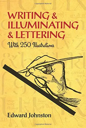
Publications such as “Writing & Illumination & Lettering” (Edward Johnston, 1906), “A Handwriting Manual and “Dryad Writing Cards” (Alfred Fairban, 1932) are some of the sources that impacted the way we learn and use the Italic script today.
2. Tools needed – a quick rundown of the recommended tools for Italic calligraphy
For practicing italic calligraphy, you will need the essential calligraphy tools.
However, you can also check the recommendation here below.
2.1 Writing tools
You can use almost any kind of writing tool to do the Italic script; however, the most common choice is the broad-edged pens.
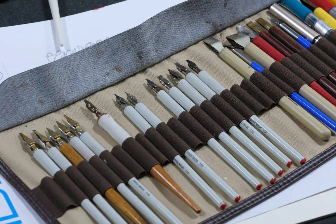
If you are just getting started with Italic calligraphy or any other broad-edged script (blackletter for example) – the Pilot Parallel Pen is the best tool you can start with.
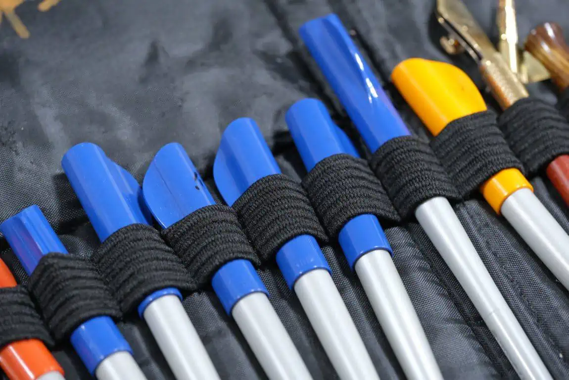
And here is why –
The Parallel Pen is a fountain pen that uses ink cartridges, meaning that you won’t have to worry about dipping your pen in ink every couple of strokes – allowing you to focus entirely on learning the basics of a script.
Besides that, the parallel pen is super simple to use, and it’s ready as soon as you take it out of the box.
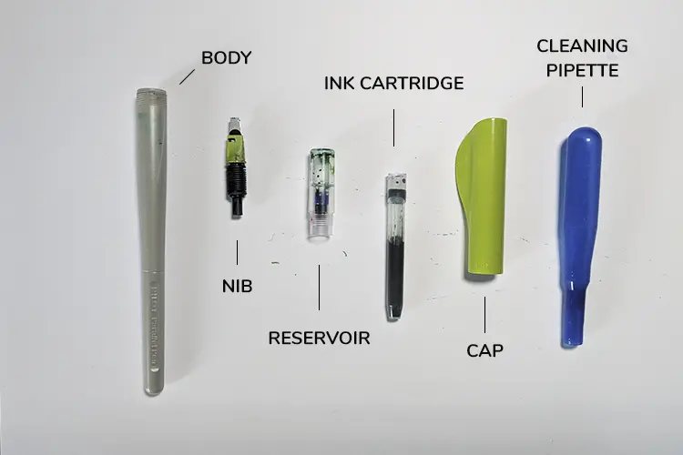
The different parts of the Pilot Parallel Pen
The only down-side of the Pilot Parallel Pen is that it has a more substantial ink flow, meaning that some types of paper are not suitable for this tool because the ink will bleed all over it – don’t worry, we will mention some appropriate kinds of papers further in the article.
The Parallel Pen is a great beginner’s tool for a variety of calligraphy styles.
Aside from the Pilot Parallel Pen, you can also go with the traditional straight holder + nib combo, and for that @Slo.lee has a few great recommendations –
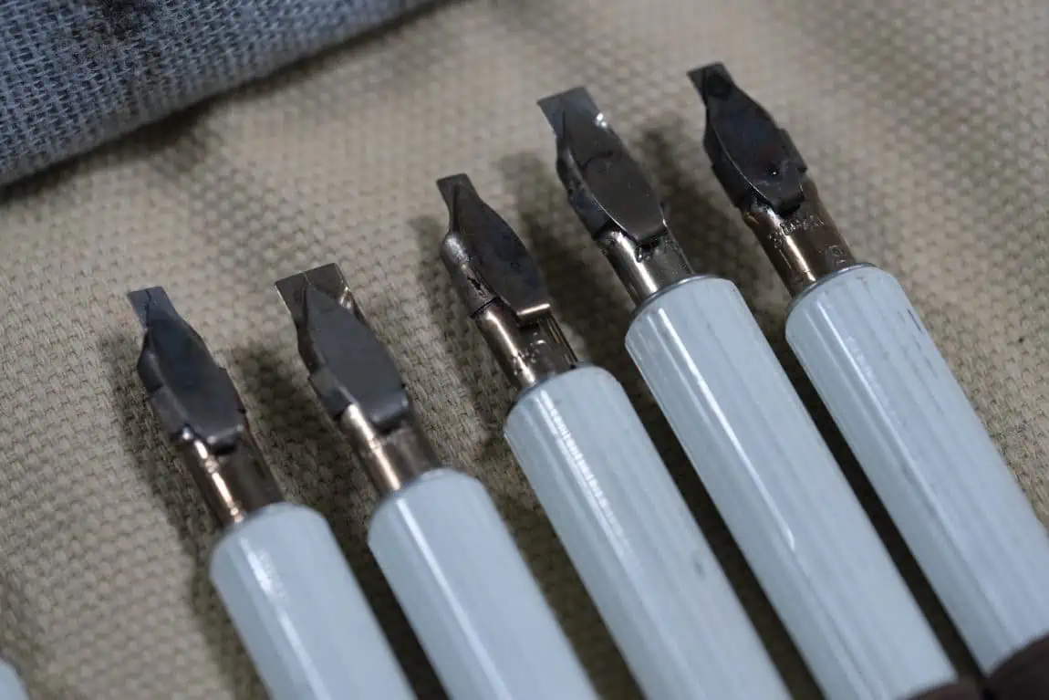
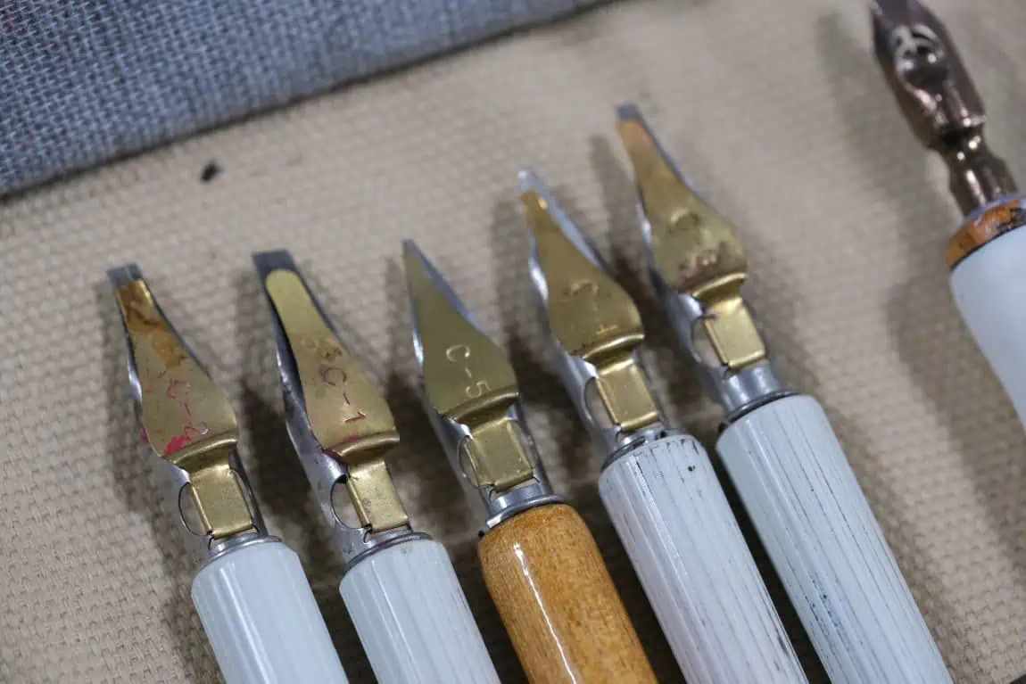
Slo also says –
‘’Between the two, parallel pen are more comfortable because you don’t have to use the ink separately (the ink cartridges), however, if you want to achieve a more sophisticated stroke, a dip pen is definitely a better choice.’’
2.2 Paper
Calligraphy paper is a SUPER essential tool/element and understandably, often overlooked by beginners.
Generally speaking, you should look for the low-absorbent smooth paper since ink bleeds are one of your worst enemies during calligraphy practice.
This also depends on the combination of ink and paper.
For example, it’s more likely that the Pilot Parallel pen will bleed through due to the heavier ink flow, while on the same paper using a dip pen and ink won’t have any problems at all.
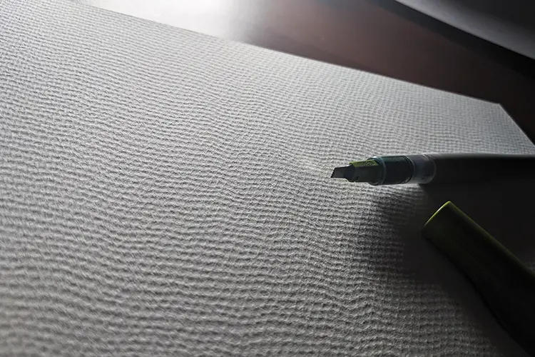
In the example below you can see the difference between premium print paper (HP) and high quality paper (Fabriano)
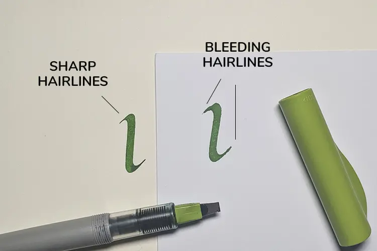
For practice sessions it’s alright if the ink bleeds (although i find it quite irritating).
However, if you are working on a more important project – you can’t go wrong if you invest in quality paper.
Also, using paper with a slight tooth will give you an additional grip to your nib, making it easier to control your strokes – at the same time, using paper with too much tooth can make it too hard to control.
Another significant mention is to distinguish practice paper from paper used for final pieces.
I mention this because the good paper is usually more expensive and you don’t want to just use it for practice.
Here is a personal paper recommendation for both practice and final pieces –
Practice calligraphy paper (cheaper) –
- Marker pads, bleed proof paper
- HP Premium 32LB – Not the best for the Pilot Parallel Pen but works excellent with dip pen and ink or gouache.
- Rhodia pads – great for both the parallel pen and dip pens
Calligraphy paper for final pieces (more expensive)
- Watercolor paper (different kinds)
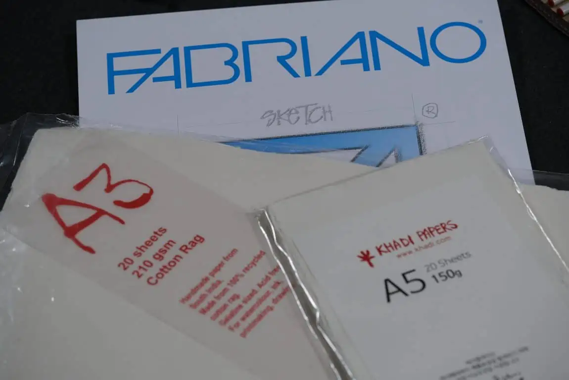
- Khadi paper
- Fabriano paper
- Clairefontaine Triomphe
- Hahnemuhle paper
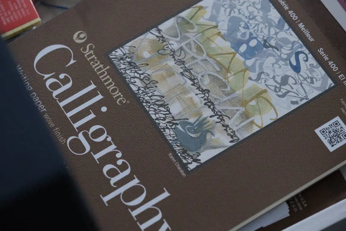
- Strathmore calligraphy paper
I cover all this and much more in my guide on the best calligraphy papers.
2.3 Other tools – inks, rulers, pencils, erasers
Before we jump to the actual writing part, I just wanted to pitch a few more recommendations that could be useful not only for the Italic script but generally for calligraphy.
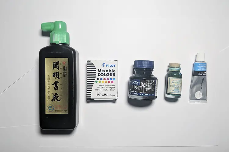
Here are a couple of recommendations for different calligraphy inks –
- Winsor & Newton calligraphy inks
- Sumi ink
- Gouache – is very versatile, you can easily manipulate the viscosity by using more/less water, mix different colors, create your own tones and palettes – I personally enjoy this sort of freedom.
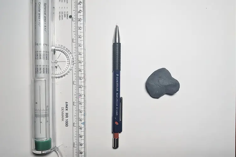
The ruler – my absolute personal favorite (that I keep suggesting on every chance I get) is the rolling ruler.
The rolling ruler is a ruler with a wheel on the backside that allows you to draw quick parallel lines – ideal for calligraphy guidelines.
As for the pencil, I prefer to use a mechanical pencil simply because it can create very faint and fine lines without ever have to sharp it.
Finally, my choice for an eraser is the kneaded eraser – ideal for deleting fine and gently drawn lines + it never leaves any crumbs (no mess).
3. Basic strokes & rules for the Italic script + the different lowercase letter groups
When learning the Italic script, it is crucial to learn the fundamental rules that dictate how to create it.
Of course, once you have learned these basic rules, you can start tweaking them and create your own styles and variations.
In other words – to break the rules, you must first learn them.
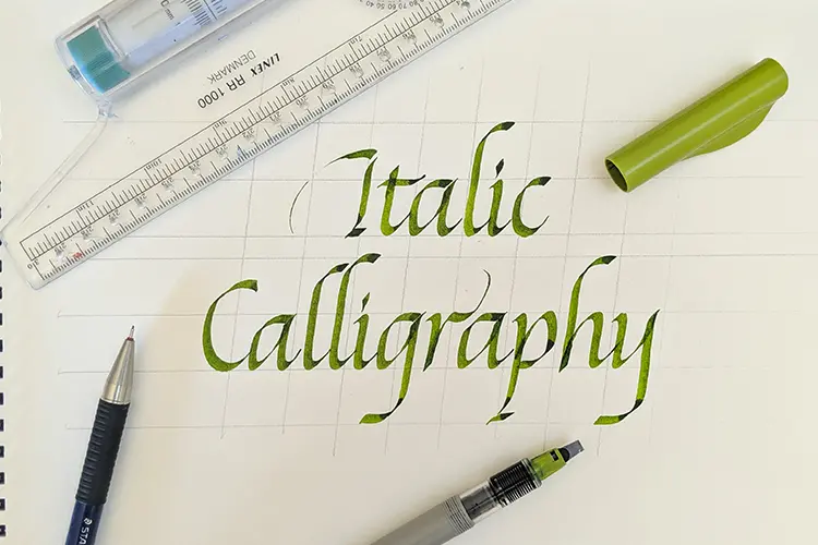
3.1 Sizing –
Let’s start off with the sizing of the italic script.
Like with many traditional scripts, the size of your letters is determined by the size of your tool.
In the case of the Italic script the rule is pretty straight forward.
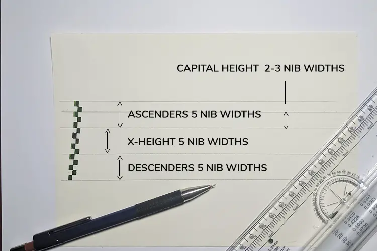
The Italic script uses 5 contiguous nib widths for the central body part (x-height), ascenders and descenders – a 5:5:5 ratio.
The capital Italic letters are a bit smaller than the ascending strokes, usually 7-8 nib widths.
Here is a visual representation –
3.2 Letter and pen angle –
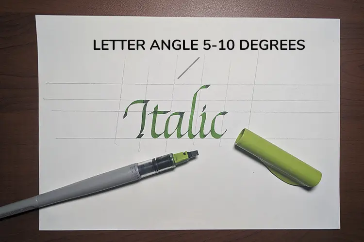
The Italic script is written with a slight forward slant usually between 5-7 degrees.
There are also variations where the slant can go all the way to 30 degrees, but I would strongly suggest that you keep it between 5-10 degrees if you are just getting started.
The pen angle is kept on a 40-45 degree angle for nearly every letter of the alphabet.
There are a few letters and strokes where you have to switch up the angle to maintain the proportions, and it’s relatively easy to memorize them.
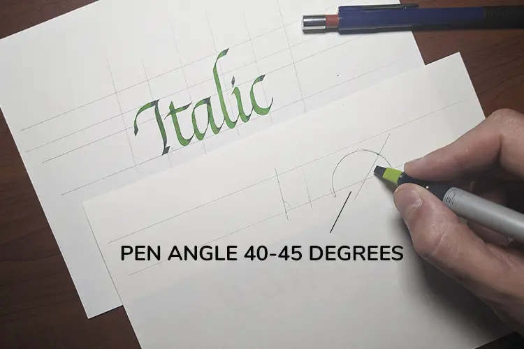
Another noteworthy mention is that the pen angle must change depending on the slant – if you are writing with a heavier slant you must adapt the pen angle to it; otherwise, the letters start to lose their shape.
This is something to consider once you begin working with a different variation, but as mentioned earlier, if you are just getting started – just stick to the 5-10 degree angle.
3.3 Letter proportions –
Generally, the Italic letterforms are contained in a parallelogram shape with a horizontal to vertical ratio of 2:3
– meaning that the letters are longer than they are wider.
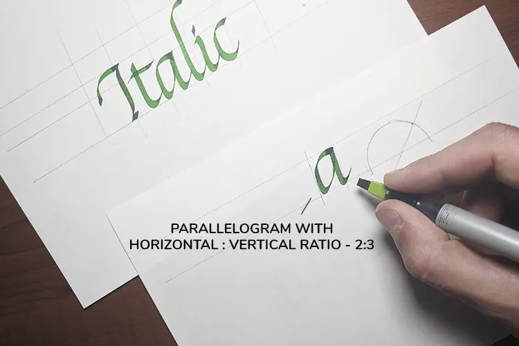
Of course, you won’t be measuring every single letter with a ruler to get the exact proportions right.
Just try to remember to keep your letters within this shape.
3.4 Basic strokes
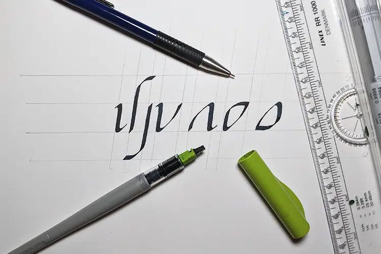
The Italic alphabet is reasonably straightforward in its construction, but don’t let that simplicity fool you because it’s precisely the simplicity of its shapes that makes it challenging to learn.
The image below shows the basic strokes used to construct most of the lowercase alphabet.
3.5 Pattern drills (super helpful!)
If you are entirely new to calligraphy and generally broad-edged scripts like Italic, I would highly recommend getting started with (pattern) drills.
This will help you to get to know the tools you are working with, and it will also help you to develop rhythm (super important), consistency and precision.
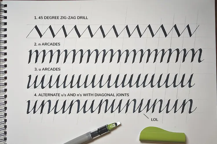
These sort of drills are great warm-up exercises even for those who are more familiar with the scripts.
These pattern drills were taken from the book by Sheila Waters – Foundations Of Calligraphy.
I would recommend that every time you practice, and before you start writing words, you simply fill one of this drill sheets.
It will help your hand muscles warm up and get you ready to practice with letters and words.
I’ve added a FREE downloadable and printable sheet along with the others – you can download them by signing up further below.
3.6 Lowercase letter groups
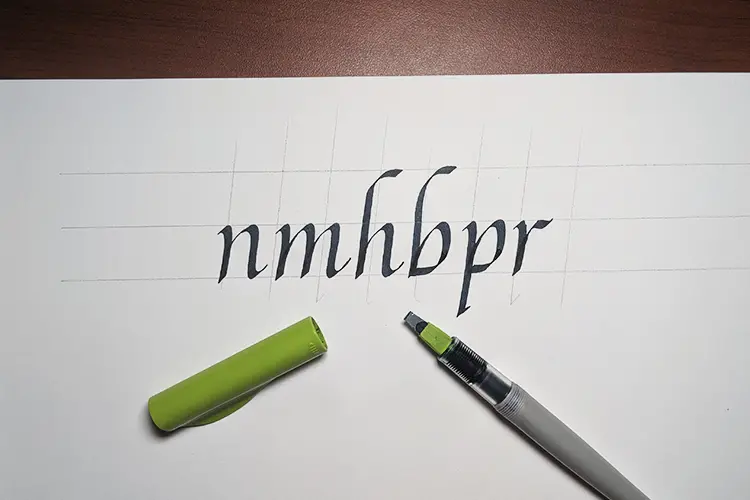
A lot of the letters in the Italic script share similar shapes, and this is precisely the reason why we divide the (minuscule) letters into different groups – makes it easier to understand their relationship, and it’s easier to practice them as well.
The Italic lowercase (minuscule) alphabet can be divided into 4 different groups –
Group one – n, m, h, b, p, r – branching letters
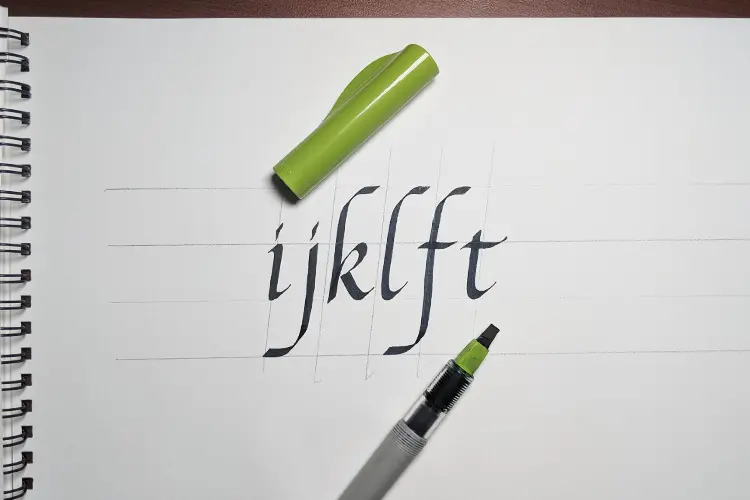
Group two – i, j, l, k, f, t – straight letters
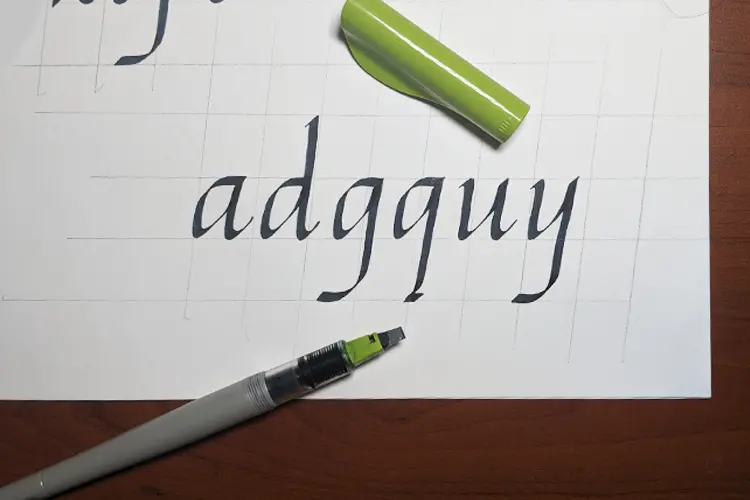
Group three – a, d, g, q, u, y – reverse branching letters
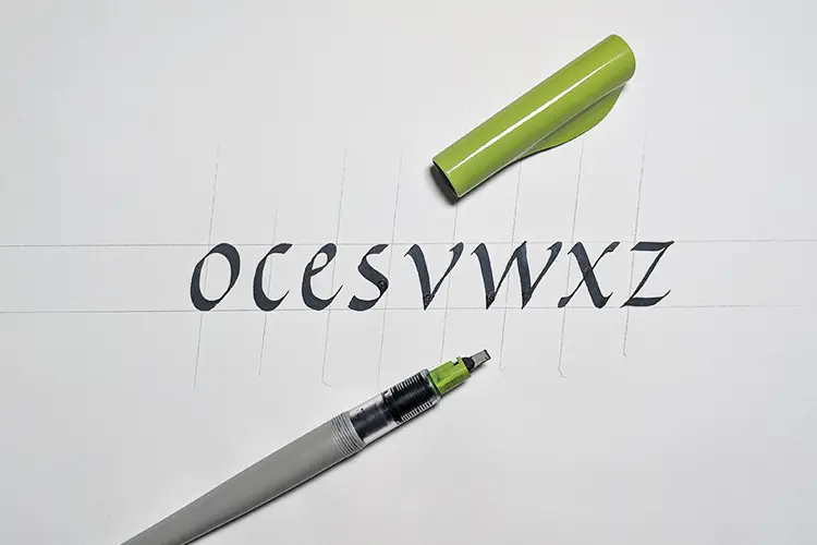
Group four – o, c, e, s, v, w, x, z – oval and diagonal letters
Check out also this YouTube tutorial by Joanne Fink where she demonstrates how to write the whole lowercase Italic alphabet –
4. FREE downloadable practice sheets
Here you can download the free practice sheets as well as the pattern drill sheet (as mentioned before).
The practice sheets need a 3mm nib width while the pattern drill is made for the green Pilot Parallel Pen 3.8 mm.
The practice sheets contain both majuscules (uppercase) and minuscules (lowercase).
Drop your email below, and you will get instant access to the Lettering Crate – a resource library filled with calligraphy worksheets (for different styles and techniques) procreate brushes and more.

Stay updated with my tutorials and get instant access to the Lettering Crate –
A growing library of free lettering & calligraphy resources that includes –
5. A few extra tips for Italic calligraphy
Here are a few additional tips from @slo.lee that you should consider when practicing the Italic script.
- DO NOT PRACTICE WHOLE ALPHABETS –
It is not an efficient way to practice, you should write the same kind of letter groups like “n” and “h”
It is a better way to write alphabets consistently - Avoid keeping the start and endpoint of strokes too round
- Practice minuscule more than majuscule
- Do not be scared about making mistakes when learning

6. Additional resources for learning the Italic script
As mentioned at the beginning of this post, it is impossible to sum up everything about the Italic script in single article.
Precisely the reason i would like to share some additional helpful resources –
- Sheila waters – Foundations Of Calligraphy
- Fred Eager – The Italic way to beautiful handwriting: cursive and calligraphic
- Margaret Shepherd – Learn calligraphy
- Edward Johnston –Writing & Illumination & Lettering
- Loyd Reynolds – Italic calligraphy and handwriting.
- On YouTube, you can also find a video series on the Italic script by Loyd Reynolds – in fact, 20 full episodes! The video quality is not the best but keeps in mind it was filmed 40 years ago. Nonetheless, it’s a real gold mine for anyone who wants to learn more about Italic calligraphy.
Final words
In this brief tutorial, we had the opportunity to explore some of the very basics of the Italic script.
It’s a beautiful and very dynamic style of writing with a ton of variations to offer.
The construction of the letters is quite clear and straightforward.
However, it takes a lot of time and practice to develop the skill of writing consistent letterforms.
Consistent practice is essential, but please remember that the way you practice plays a vital role in the development of your skills.
That pretty much goes for every lettering/calligraphy style.
Is there something you don’t understand?
Maybe you have a specific question in mind, or perhaps you want to get some constructive feedback on your artwork?
Feel free to drop a comment below, or even better –
Join our official Facebook group!
Our group is a place where you can –
- Share your work
- Get constructive feedback
- Network with fellow lettering & calligraphy artists
- Ask specific questions about lettering & calligraphy
- Much more!
Thank you for joining for another tutorial, and until the next time –
Stay AWESOME!!
Pin me!
About the author

Hey, I’m Max Juric, and I’m deeply passionate about calligraphy and hand lettering.
I’ve spent years honing my skills in the art of lettering, working with hundreds of clients from all over the world on design projects such as logotypes, branding, custom lettering, murals, and more.
But my journey doesn’t end there. I’ve also dedicated myself to sharing my knowledge and expertise with others, creating a wealth of resources including tutorials, articles, and podcasts.
It’s been incredibly rewarding to see thousands of people engaging with my content each month. Knowing that I’m helping fellow enthusiasts grow and develop their skills makes me really happy.
Welcome to Lettering Daily, your hub for all things lettering and calligraphy. Whether you’re a seasoned pro or just starting out, I’m here to inspire and guide you on your lettering journey. Stick around, and let’s explore the world of letters together!

Hi! I recently bought Fred Eager’s book after hours of research and with the help of a dip pen that was gifted to me years ago I’ve decided to embark on the journey of Italic calligraphy. Your website is filled with helpful information and now I’m about to buy the 3.8 pen. I’ve already learnt the whole alphabet but I want to achieve perfection and I’m sure that thanks to your many advices I shall make it.
You know what’s funny? My hometown is Fabriano, yes, the “town of paper” as it’s called here, the one that makes the paper you love. If you ever visit, be sure to check the Museum of Paper! You can even make paper with the old method in their workshop and you can see the ancient wooden hammers that were used to disintegrate the cloths to get the fiber for the paper.
Thanks! Really helps!
Happy to hear that 🙂
I really enjoyed your article. I’m not sure how to get the guide sheets but I would appreciate it if you could send them to me. thanks so much!
All the worksheets are inside the Lettering Crate. Just sign up for the newsletter and follow the instructions to get access to all of the freebies i currently offer.
Hi
Can you please send my the beginner italic template. I’m just starting out.
This had been very helpful.
Thanks
Hey Jacky, all the freebies are inside the Lettering Crate. Just drop your email on the sign up form, follow the instructions and you’ll get instant access to the Crate.
If you have any questions don’t hesitate to send me an email.
Where can I find the italics practice sheets
Jacky, please send your practice sheets!
Thank you!
Linda
I am beginner. I want to learn the Italic calligraphy. Thanks
Can you send me the beginner download pages. I’m eager to get started.
Thank you,
Melody Kuemin
All the worksheets are inside the Lettering Crate. Just sign up for the newsletter and follow the steps.
Hi!
Subscribed a while ago, and still no email. Is it automatic?
TIA,
Laurie
Send me an email with the address that you used and ill fix it right away.
Hello! Thank you so much for putting this together. I’m going to start my journey on calligraphy and excited to start with Italics. Quick question, the practice templates are they formatted for letter size? planning to have them printed out somewhere since I don’t have a printer at home.
Thanks so much in advance 🙂
Thank you for the kind comment, Daphne. The worksheets are all A4 paper size so it’s a standard format. The size of letters, however, is for a specific nib size.
I am an alien who was born and grew up in Thailand. 🙂
2020 Christmas made me think of writing a beautiful wishes card.
Fortunately, my boss read my mind. She just asked for my help with 20 cards.
And I have found this the most helpful article I ever had.
Just want to say Thank you so very much, indeed.
From now on I will start learning in real since I started only dreaming for years.
I am in.
Once again, I appreciated this.
Hatty
Thank you so much, Hatty! Im really glad to hear that this article was helpful for you 🙂
Hi. I just entered my email and confirmed it from my inbox. Excited to start learning Italic calligraphy, but I’m much more interested in the sharpened style of the Italic alphabet. Are there any resources here? Also I do plan on getting Pilot Parallel pens. Main goal is to just use 1.1mm or 1.5mm stub nib fountain pens writing pen pals letters. I’d like to know if there are any other parts of this website talking about adapting broad edge calligraphy to every day pocketable writing as long as the paper can handle the ink flow. Italic and chancery shouldn’t be too difficult. Thanks!
Thank you so much for your comment and suggestion. I don’t have anything like that yet, but it will go definitely on the topic list I have for the site 🙂
Thank you for your intro and tutorial. I would like to access your practice sheets.
Thank you Peter, the worksheets are located in the Lettering Crate. Drop your email and you’ll get instant access to the Lettering Crate. Aside from these worksheets, you’ll be able to download all the currently available worksheets. If you have any questions, shoot me an email 🙂
I am a beginner. Thanks.
All lines are loving and caring. I want to know how to write rr , ss ,tt, vw ff in italic hand ..
Hey Amit, I will most definitely address that in the next update. Thank you for your feedback!
Many thanks, super excited to know more about calligraphy. Lettering daily page cleared many of my doubts. Thanks again…
Thank you Sakthi! I really appreciate it 🙂
Hi,
Unregistered a few months ago and have been receiving the newsletters but haven’t been able to access the crate. When I try to access it I keeps telling me I have the wrong password and I can’t see my way to reset it.
If you could help that would be great!
Thanks
Alex
Hey Alex, please shoot me an email in case you are struggling with accessing the Lettering Crate.
I love this website and now my 12 year old just got her first ‘pen’ for her birthday she is reading your articles too.
Thank you – you are such an inspiration!
Thank you, Michelle! I am so happy to hear that 🙂
Hey Deana, please send me an email and i will fix the issue asap! 🙂
Hello Sandra,
What link did you try to download the sheets? Have you signed up for the Lettering Crate?
Hey Amy, sorry to hear that you are struggling with this. Please send me an email directly and I will help you fix the issue ASAP 🙂
Thank you for your sharing~~
I need practice sheets.
Did you sign up for the newsletter and the Lettering Crate?
I signed up for it , but still didn’t get it !!
Please send me an email and ill fix it right away! 🙂
thank you for this.
You are very welcome!
Looking forward to learning more!
Glad you do Barry! 🙂
Hi,
I’ve registered my email address but I haven’t yet received the confirmation email. When can I expect it? I would really like to try out the resources you’ve provided. I
Thanks
Hey Sorry to hear that! Unfortunately, sometimes these emails tend to end up either in the spam folder or other folders your email provider has (like promotions). The best way to deal with this situation is to shoot me an email directly. Then I can check it from my end and fix any roadblocks there might be. I reply to emails the same or the next day, whereas I only visit website comments once or twice a month. Thank you for understanding! 🙂
Hey Patricia, my apologies for the late response on your comment. I was traveling and then i was moving to a new place and i really didn’t had the time to reply to every comment. I am really sorry you were facing issues with the subscription and I am more than willing to help you sort this out. Please shoot me an email at – letteringdaily@gmail.com
I will get you going in no time! 🙂
beginner need HELP
How can I help Gill?
Hello Margaret, i cannot take your email. You have to place it in the designated area (the sign-up form) and then confirm your subscription. If you need help with that, i’ll be happy to oblige 🙂
Also support